Case Studies
Rebranding for Trust and Conversion in a Competitive Market
Overview
Resumeble is a professional service dedicated to helping job seekers secure interviews through expert resume writing and career coaching. While they had a strong internal development team, their digital presence had become visually dated and was creating friction in the user journey.
The Project: A strategic design overhaul covering the public-facing website, a redesigned checkout funnel, and a full UI refresh for their proprietary writer-client collaboration portal.
Objectives / Problem
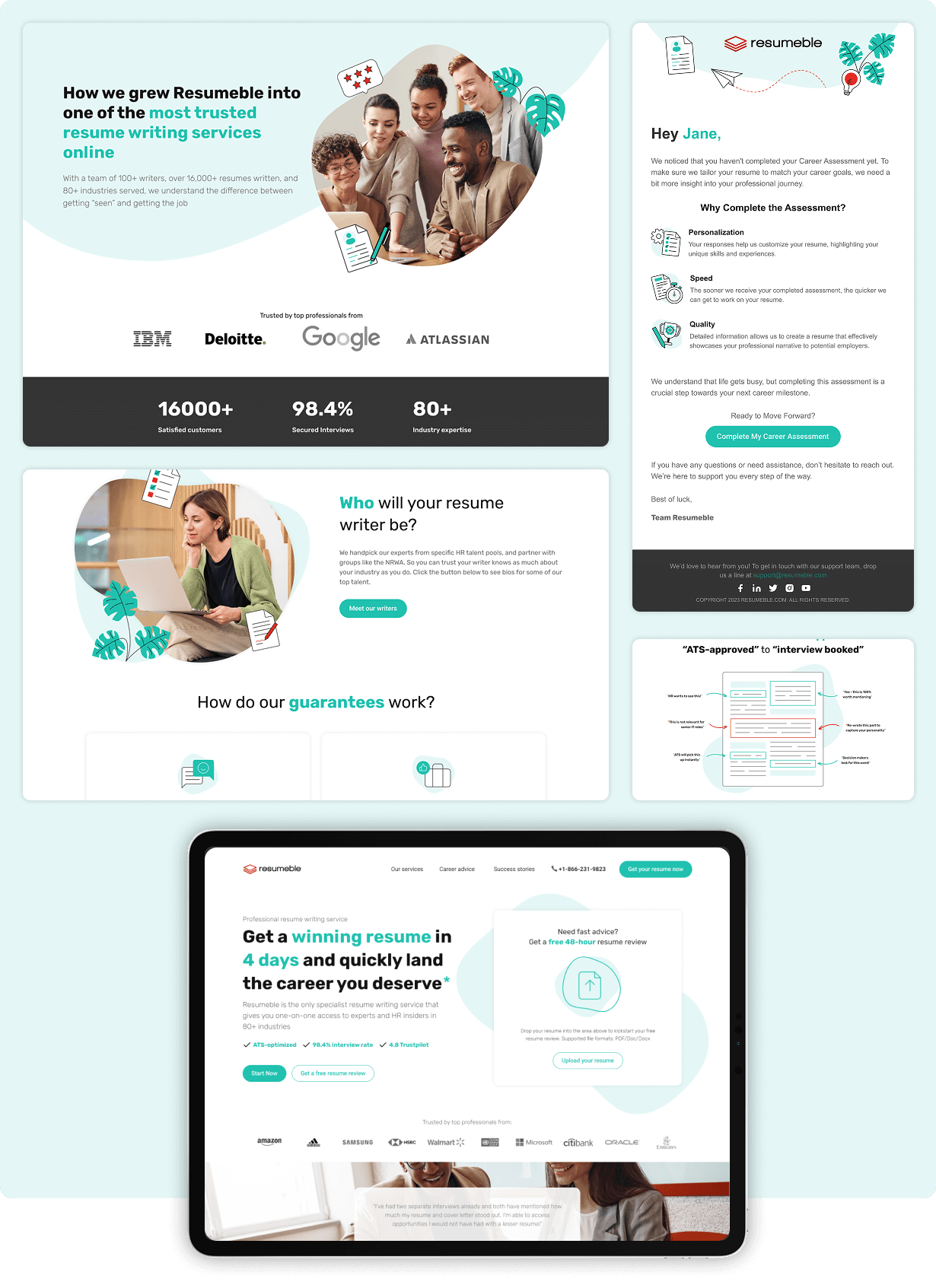
The brand was struggling with a visual identity that felt aggressive and misaligned with the supportive nature of career coaching.
- The “Warning Red” Palette: The original site relied heavily on a saturated red color scheme. In a professional service context, excessive red can inadvertently signal danger or error, creating subconscious anxiety for users during the high-stress activity of job hunting.
- Dated Aesthetics: The layout felt cluttered and lacked the clean, modern feel associated with modern career advancement tools.
- Checkout Friction: The transition from browsing services to completing a purchase was clunky and inconsistent with the brand, leading to potential drop-offs.
- Fragmented Collaboration: The backend application where writers and clients interacted was functional but lacked an intuitive flow, making the fulfillment process more difficult than necessary.
The Solutions
Digital Design
- Strategic Color Psychology and Visual Language: We completely reimagined the brand’s visual vocabulary to better reflect professional growth and reliability.
- The Green and White Pivot: We replaced the dominant red with a clean, minimalist palette of professional greens and whites. This shift instantly softened the brand’s tone, projecting growth and success while reserving red only for critical warning accents.
- Custom Graphic Treatment: To avoid the “generic” look of standard stock photography, we developed a unique treatment that blended photography with custom illustrations. This created a cohesive, branded look that felt both human and high-tech.
- Minimalist UI Principles: We stripped away unnecessary clutter, focusing on white space and clear typography to guide users through the complex information involved in resume packages.
Web Design
- Optimizing the Conversion Path Working closely with their internal developers, we provided the design framework for a smoother, high-conversion user experience.
- High-Performance Checkout Flow: We redesigned the entire checkout sequence from the ground up. By simplifying the form fields and aligning the visual cues with the new branding, we created a frictionless path to purchase.
- Back-End Application Refresh: We extended the new design system into the fulfillment application. We restructured the UI to make the collaboration between writers and clients more intuitive, ensuring that the process of exchanging drafts and feedback felt organized and professional.
The Internal Impact
The redesign allowed Resumeble to move from a utility-focused site to a premium brand that commands higher authority in the career services space.
- Brand Perception Shift: The new minimalist aesthetic positions the company as a modern, sophisticated partner for C-suite and high-level professionals.
- Increased Operational Clarity: By redesigning the backend portal, the company reduced the mental load on their writing staff, allowing them to focus on the content of the resumes rather than navigating a confusing interface.
- Design-Dev Synergy: We acted as the specialized creative arm, providing high-fidelity designs that their internal developers could implement with precision, ensuring the final product looked exactly as intended.
Project Gallery

READY TO GET STARTED?
Great ideas need the right infrastructure to scale. From high-conversion websites to custom applications, we build the tools that turn your vision into a high-performance business asset.
